A retail key performance indicator (KPI) dashboard helps teams see what is happening across sales, inventory, products, stores, and customers without digging through separate reports every day.
For many retailers, the starting point is not a complex business intelligence (BI) system. It is usually a set of exported spreadsheet files from point-of-sale (POS) systems, ecommerce platforms, inventory tools, or accounting software. Those comma-separated values (CSV) or Excel spreadsheet (XLSX) files already contain most of the data needed to answer practical questions:
- Are sales growing or slowing down?
- Which stores are performing best?
- Which product categories drive revenue?
- Are stockouts or slow-moving items hurting profit?
- Is the average order value high enough?
- Where should the team focus this week?
This guide explains what a retail analytics dashboard is, which metrics to track, what data you need, and how to build one from spreadsheet exports.
What is a retail KPI dashboard?
A retail KPI dashboard is a report that turns raw retail data into a clear view of business performance.
Instead of reading thousands of rows of transactions, a dashboard summarizes the most important retail metrics, such as total sales, gross margin, average order value, inventory turnover, sell-through rate, stockout risk, and store performance.
A useful retail dashboard should not only show numbers. It should help the team make decisions, such as:
- Which store needs attention?
- Which product category is carrying revenue?
- Which stock keeping units (SKUs) are overstocked or close to stockout?
- Which days or campaigns drive the most sales?
- Which customers or segments are most valuable?
For small and midsize retail teams, a dashboard often starts with spreadsheet data. This is the same starting point covered in our guide to retail data analytics: a POS export, inventory report, product list, and customer file can be enough to create a working dashboard before investing in a larger analytics setup.
Key retail KPIs to track
The right KPIs depend on your retail model, but most dashboards should cover five areas: sales, profitability, inventory, store performance, and customer behavior.
1. Sales KPIs
Sales KPIs show whether revenue is growing and where it comes from.
Common sales KPIs include:
| KPI | What it shows | Spreadsheet fields needed |
|---|---|---|
| Total revenue | Overall sales during a period | Date, transaction ID, sales amount |
| Net sales | Sales after discounts, returns, or refunds | Gross sales, discount, refund |
| Transactions | Number of completed orders | Transaction ID, date |
| Units sold | Product quantity sold | SKU, quantity |
| Average order value | Revenue per transaction | Sales amount, transaction ID |
| Items per transaction | Basket size | Transaction ID, quantity |
| Sales by day, week, or month | Sales trend over time | Date, sales amount |
Sales KPIs are usually the first layer of a retail dashboard, but they should not be the only layer. Revenue can rise while margin falls, inventory worsens, or store execution weakens.
2. Profitability KPIs
Profitability KPIs help the team understand whether sales are actually creating profit.
Important profitability metrics include:
| KPI | What it shows | Spreadsheet fields needed |
|---|---|---|
| Gross margin | Profit after cost of goods sold (COGS) | Revenue, COGS |
| Gross margin rate | Margin as a percentage of sales | Revenue, COGS |
| Markdown rate | Share of sales lost to discounts | Original price, selling price, discount |
| Profit by product | Which SKUs generate profit | SKU, revenue, COGS |
| Profit by store | Which locations are most profitable | Store, revenue, COGS, labor or operating cost |
If your export does not include COGS, you can still start with revenue metrics. But the dashboard will become much more useful once product cost data is added.
3. Inventory KPIs
Inventory KPIs show whether the business has the right products in the right quantity.
Useful inventory KPIs include:
| KPI | What it shows | Spreadsheet fields needed |
|---|---|---|
| Inventory on hand | Current stock level | SKU, store, current quantity |
| Sell-through rate | How much received inventory has sold | Units sold, units received |
| Inventory turnover | How quickly inventory is sold and replaced | COGS, average inventory |
| Days of supply | How long current stock may last | Stock on hand, average daily sales |
| Stockout rate | How often items are unavailable | SKU, stock status, date |
| Reorder point | When to replenish inventory | Lead time, daily sales, safety stock |
| Slow-moving inventory | Products tying up cash | SKU, stock on hand, recent sales |
Inventory metrics are especially important when the dashboard is used for replenishment planning, store transfers, or seasonal buying.
The stock-cover review guide shows how to trace these dashboard signals to SKU-level stock, sales, and open-order records before changing a replenishment plan.
4. Store performance KPIs
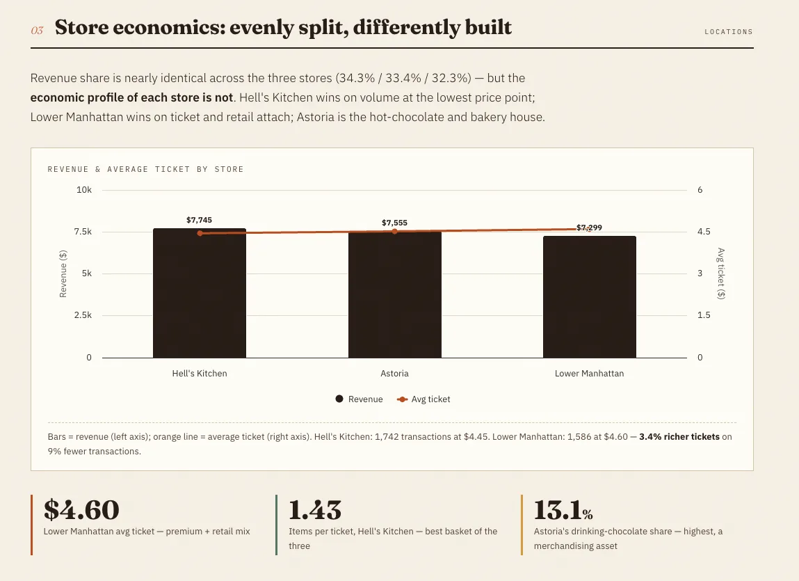
For retailers with multiple locations, store-level KPIs help separate chain-wide trends from local execution.
Common store KPIs include:
| KPI | What it shows | Spreadsheet fields needed |
|---|---|---|
| Revenue by store | Sales contribution by location | Store, sales amount |
| Transactions by store | Store traffic converted into orders | Store, transaction ID |
| Average ticket by store | Spend per transaction | Store, sales amount, transaction ID |
| Units per transaction | Basket size by location | Store, transaction ID, quantity |
| Category mix by store | What each store sells best | Store, category, sales amount |
| Sales per square foot | Store productivity | Store size, revenue |
| Conversion rate | Share of visitors who buy | Foot traffic, transactions |
Store dashboards are useful because two stores can have similar revenue but very different economics. One may win through traffic, another through premium products or higher basket value.
5. Customer KPIs
Customer KPIs help retail teams understand retention, loyalty, and purchase behavior.
Useful customer metrics include:
| KPI | What it shows | Spreadsheet fields needed |
|---|---|---|
| New vs returning customers | Customer mix | Customer ID, first purchase date |
| Repeat purchase rate | Loyalty and retention | Customer ID, transaction dates |
| Customer lifetime value | Long-term value per customer | Customer ID, revenue, order history |
| Purchase frequency | How often customers buy | Customer ID, transaction dates |
| Average spend per customer | Customer-level revenue | Customer ID, sales amount |
| Segment revenue | Which customer groups matter most | Customer segment, sales amount |
Not every retailer has customer-level data. If the POS export does not include customer IDs, you can still build a useful dashboard from sales, product, store, and inventory data.
Retail KPI dashboard example table
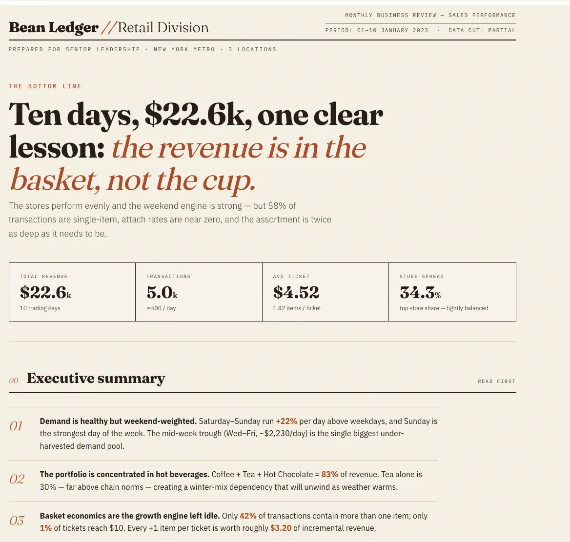
Here is a simplified example from a three-store coffee retailer using 10 days of POS spreadsheet data.
| Dashboard metric | Example result | What it means |
|---|---|---|
| Total revenue | $22,598.69 | Sales volume across the reporting period |
| Transactions | 4,998 | Number of completed orders |
| Quantity sold | 7,099 items | Total units sold |
| Average revenue per transaction | $4.52 | Average ticket size |
| Items per transaction | 1.42 | Basket size is relatively low |
| Number of stores | 3 | Multi-location comparison is possible |
| Top store revenue share | 34.3% | Revenue is evenly distributed across stores |
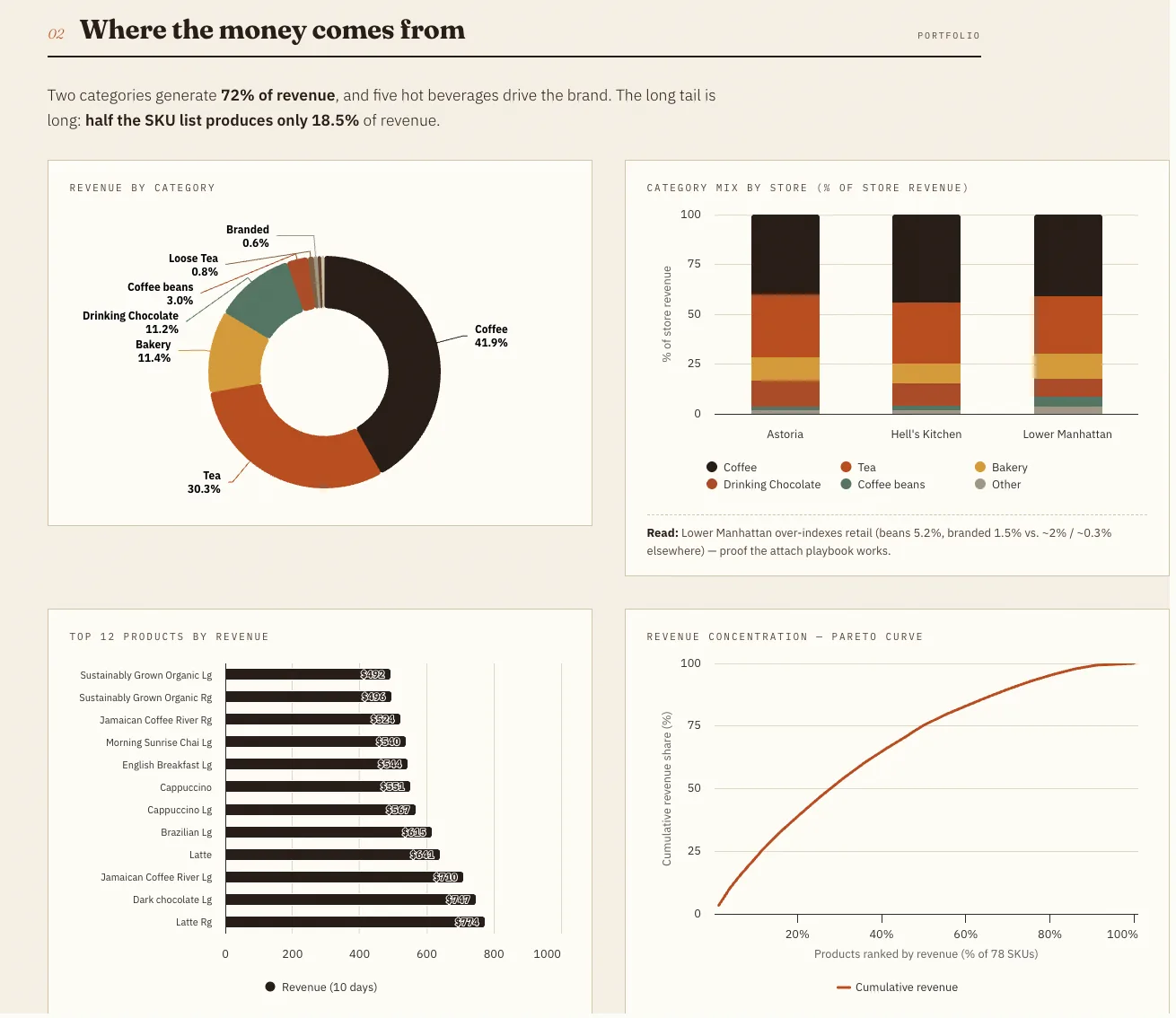
| Coffee revenue share | 41.9% | Coffee is the main revenue driver |
| Tea revenue share | 30.3% | Coffee and tea together drive over 72% of revenue |
| Retail and packaged products share | Under 5% | Add-on and retail product sales are weak |
This dashboard does more than report sales. It points to business questions.
The three stores have similar revenue shares, so the issue is not one underperforming location. Coffee and tea dominate revenue, while packaged products and branded items contribute very little. The average basket contains only about 1.42 items, which suggests an opportunity to improve add-ons, bundles, and merchandising.
The dashboard also flags a data quality issue. One day shows unusually low revenue compared with the rest of the period. Before treating it as a real sales decline, the team should check whether the export was incomplete.
Data you need: sales, inventory, stores, and customers
A retail KPI dashboard works best when data is organized into a few clean tables.
Sales data
Sales data is the foundation. A basic sales export should include:
| Field | Example |
|---|---|
| Date | 2023-01-01 |
| Transaction ID | TXN-10001 |
| Store | Lower Manhattan |
| SKU | LATTE-RG |
| Product name | Latte Regular |
| Category | Coffee |
| Quantity | 2 |
| Unit price | 4.50 |
| Discount | 0.50 |
| Sales amount | 8.50 |
This table supports revenue, transactions, units sold, average ticket, product ranking, category mix, and store comparison.
Inventory data
Inventory data helps connect sales to stock availability.
Useful fields include:
| Field | Example |
|---|---|
| SKU | LATTE-RG |
| Store | Lower Manhattan |
| Opening stock | 120 |
| Received quantity | 40 |
| Ending stock | 28 |
| Reorder point | 30 |
| Lead time days | 5 |
| Stockout days | 1 |
This table supports stock on hand, reorder alerts, sell-through rate, stockout risk, and days of supply.
Store data
Store data adds context to location performance.
Useful fields include:
| Field | Example |
|---|---|
| Store ID | NYC-01 |
| Store name | Lower Manhattan |
| Region | New York Metro |
| Store type | High street |
| Store size | 1,200 sq ft |
| Opening date | 2021-06-15 |
This table supports store ranking, region comparison, sales per square foot, and location-level benchmarking.
Customer data
Customer data is optional but valuable.
Useful fields include:
| Field | Example |
|---|---|
| Customer ID | C-10231 |
| First purchase date | 2022-11-04 |
| Customer segment | Returning |
| Loyalty status | Member |
| Email opt-in | Yes |
This table supports retention, repeat purchase rate, customer lifetime value, and segment-level analysis.
Step-by-step: build a dashboard from spreadsheet exports
Step 1: Collect the source files
Start with the exports you already have. For many retail teams, this means:
- POS sales export
- Product catalog
- Inventory report
- Store list
- Customer or loyalty export
- Refunds or discounts report
You do not need every file on day one. A useful first dashboard can often be built from sales data alone.
Step 2: Clean the data
Before creating charts, check the spreadsheet for common problems:
- Missing dates
- Duplicate transaction IDs
- Blank product names
- Inconsistent store names
- Negative quantities
- Refunds mixed with sales
- Partial-day exports
- Currency stored as text
- Categories spelled in multiple ways
This step matters because dashboard mistakes often come from messy source data, not from the chart itself.
In the coffee retailer example, one day had much lower revenue than the rest of the period. That should be flagged as partial or incomplete data before anyone concludes that sales suddenly dropped.
Step 3: Create a KPI summary
Build a simple summary table first.
Good first metrics include:
| KPI | Formula idea |
|---|---|
| Total revenue | Sum of sales amount |
| Transactions | Count of unique transaction IDs |
| Units sold | Sum of quantity |
| Average order value | Revenue divided by transactions |
| Items per transaction | Units sold divided by transactions |
| Revenue by store | Sum of sales amount grouped by store |
| Revenue by category | Sum of sales amount grouped by category |
| Top products | Products ranked by revenue |
This gives the dashboard a stable base before adding charts.
Step 4: Add trend and comparison views
Once the KPI summary is correct, add visual sections:
- Daily or weekly revenue trend
- Revenue by store
- Revenue by category
- Top products by revenue
- Inventory alerts
- Gross margin by product or category
- Customer repeat purchase trend
The goal is not to add as many charts as possible. The goal is to make the most important decisions easier.
Step 5: Connect metrics to actions
A dashboard should lead to decisions.
For example:
| Dashboard finding | Possible action |
|---|---|
| Average ticket is low | Test bundles, add-ons, or checkout prompts |
| One store has high traffic but low average order value | Train staff on cross-sell offers |
| Coffee and tea dominate revenue | Protect supply and quality for core categories |
| Packaged products have low attach rate | Improve shelf placement or offer drink and retail bundles |
| Inventory turnover is slow | Reduce reorder quantity or mark down slow movers |
| Stockouts are frequent | Adjust reorder points or safety stock |
This is where a retail KPI dashboard becomes operational instead of decorative.
Step 6: Refresh the dashboard regularly
Decide how often the dashboard should update.
Daily dashboards are useful for store operations and stock alerts. Weekly dashboards are better for category review, merchandising, and campaign performance. Monthly dashboards work well for leadership reporting and longer-term planning.
The refresh frequency should match the decision cycle.
Common mistakes when building a retail KPI dashboard
Mistake 1: Tracking too many KPIs
A dashboard with 40 metrics is usually harder to use than a dashboard with 8 to 12 focused metrics.
Start with the KPIs that answer your most important business questions. Add more only when the team knows how they will use them.
Mistake 2: Mixing complete and incomplete data
Partial exports can distort trends.
If one day, store, or channel has incomplete data, mark it clearly. Otherwise, a dashboard may show a false sales drop or false stockout problem.
Mistake 3: Looking only at revenue
Revenue is important, but it does not explain everything.
A store with lower revenue may have better margins. A product with high sales may be heavily discounted. A category with modest sales may drive profitable add-on purchases.
Pair revenue with margin, quantity, basket size, and inventory data whenever possible.
Mistake 4: Ignoring product hierarchy
Retail data often has several product levels:
- SKU
- Product name
- Product type
- Category
- Brand
- Size or variant
If these levels are messy, category charts and top-product rankings become unreliable. Clean product mapping before making merchandising decisions.
Mistake 5: Building charts before defining decisions
Charts should answer decisions, not decorate reports.
Before adding a chart, ask: "What action would we take if this number changes?"
If there is no answer, the metric may not belong on the dashboard.
How AI can speed up retail dashboard creation
Artificial intelligence (AI) can help retail teams turn spreadsheet exports into a dashboard faster, especially when the data is spread across multiple CSV or XLSX files.
For example, a team may have one file for POS transactions, another for inventory, and another for store locations. AI can help clean column names, detect missing values, summarize sales by store or category, identify unusual records, and produce a first dashboard or written report.
This is where a tool like hiData AI Sheets can fit naturally. hiData is useful when you already have exported spreadsheet files and want to quickly organize them into a dashboard or report. It does not require connecting a database, and it should not be treated as a full BI replacement. The practical use case is simpler: upload sales, inventory, store, or customer spreadsheets, then use AI to summarize KPIs, create charts, flag anomalies, and turn the results into a readable analysis.
For retail teams that are not ready for a large BI project, this can be a fast way to move from raw exports to a working dashboard draft.
FAQ
What should be included in a retail KPI dashboard?
A retail KPI dashboard should usually include total revenue, transactions, average order value, units sold, gross margin, inventory status, store performance, product category mix, and customer metrics if customer data is available.
What is the difference between a retail dashboard and a retail KPI dashboard?
A retail dashboard can show any retail data, while a retail KPI dashboard focuses on key performance indicators that measure business performance. A KPI dashboard should help teams track goals and make decisions.
Can I build a retail KPI dashboard in Excel or Google Sheets?
Yes. Excel and Google Sheets can be enough for a first retail KPI dashboard, especially if your data comes from POS, inventory, or ecommerce exports. You can use pivot tables, formulas, charts, and filters to summarize the data.
What spreadsheet data do I need for a retail dashboard?
The most useful data includes sales transactions, product details, inventory levels, store information, and customer records. At minimum, you need date, transaction ID, store, product, quantity, and sales amount.
Which retail KPIs matter most?
The most important KPIs are usually total revenue, gross margin, average order value, units sold, inventory turnover, sell-through rate, stockout rate, revenue by store, and revenue by product category.
How often should a retail KPI dashboard be updated?
Daily updates are useful for sales monitoring and inventory alerts. Weekly updates are better for merchandising, campaign review, and store coaching. Monthly updates are best for leadership reporting and longer-term planning.
How can AI help with retail analytics?
AI can help clean spreadsheet data, summarize KPIs, generate charts, detect anomalies, and explain dashboard findings in plain language. It is especially useful when teams need a quick first analysis from exported CSV or XLSX files.
Conclusion
Retail teams do not always need to start with a large BI project. Many useful dashboards begin with the files the team already has: POS exports, inventory spreadsheets, product catalogs, store lists, and customer reports.
hiData AI Sheets helps teams upload those spreadsheet files, summarize retail KPIs, generate charts, flag unusual records, and turn raw exports into a readable dashboard or report draft.
Use your retail spreadsheet data to build clearer dashboards faster with hiData AI Sheets - Start for free.